![]()
Do you find it difficult to choose colours artwork? If so, here are my favourite ten methods to choose a colour palette for surface design or illustration.
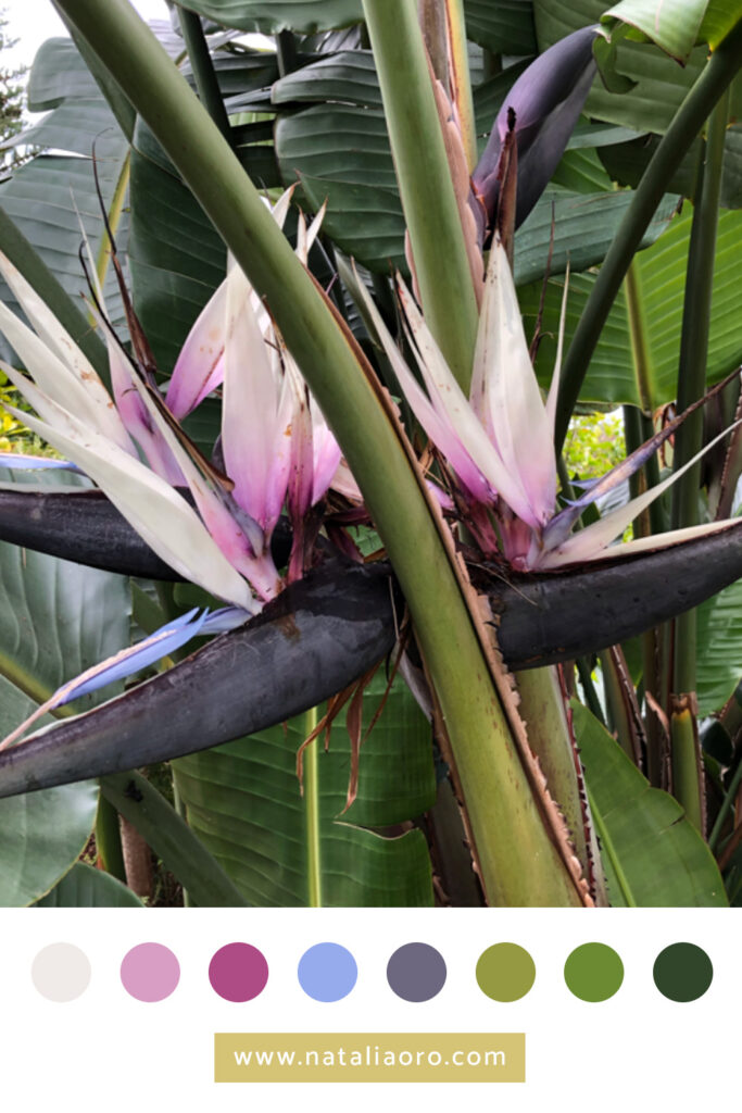
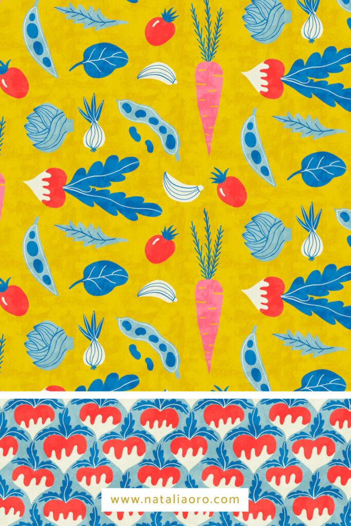
1. Extract colours from your photos
When I’m on holiday, I try to capture the colours around me. I like to take pictures with my phone when I see a beautiful or unusual colour combination. Then I create a colour palette from these pictures.
Here is an example of a photo, the colours I extracted from it and the pattern I designed afterwards.
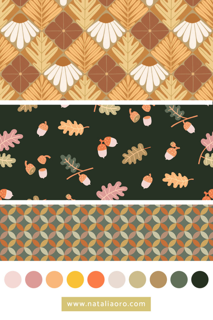
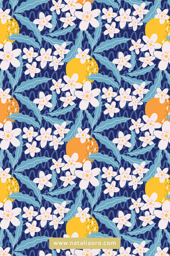
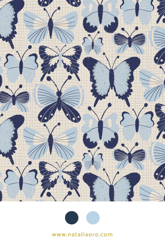
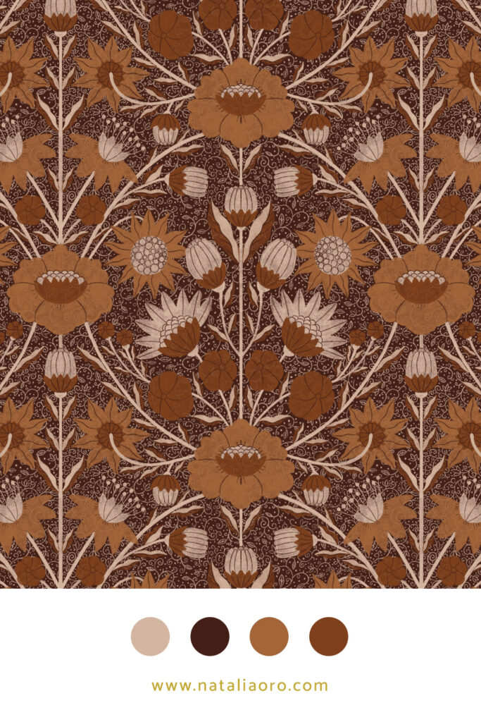
2. Create a moodboard and choose your colours from it
A similar approach is to create a moodboard for a particular theme and select the colours from these collected images. Below is an example of the mini collection and colour palette I used for these autumn prints.
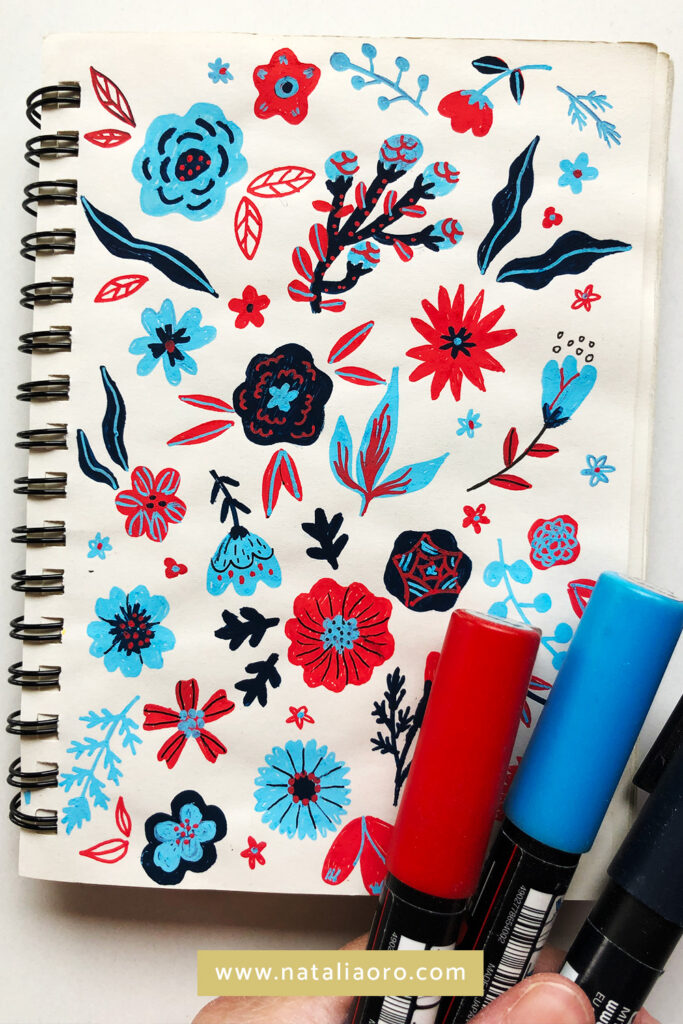
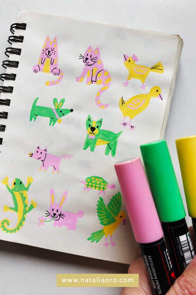
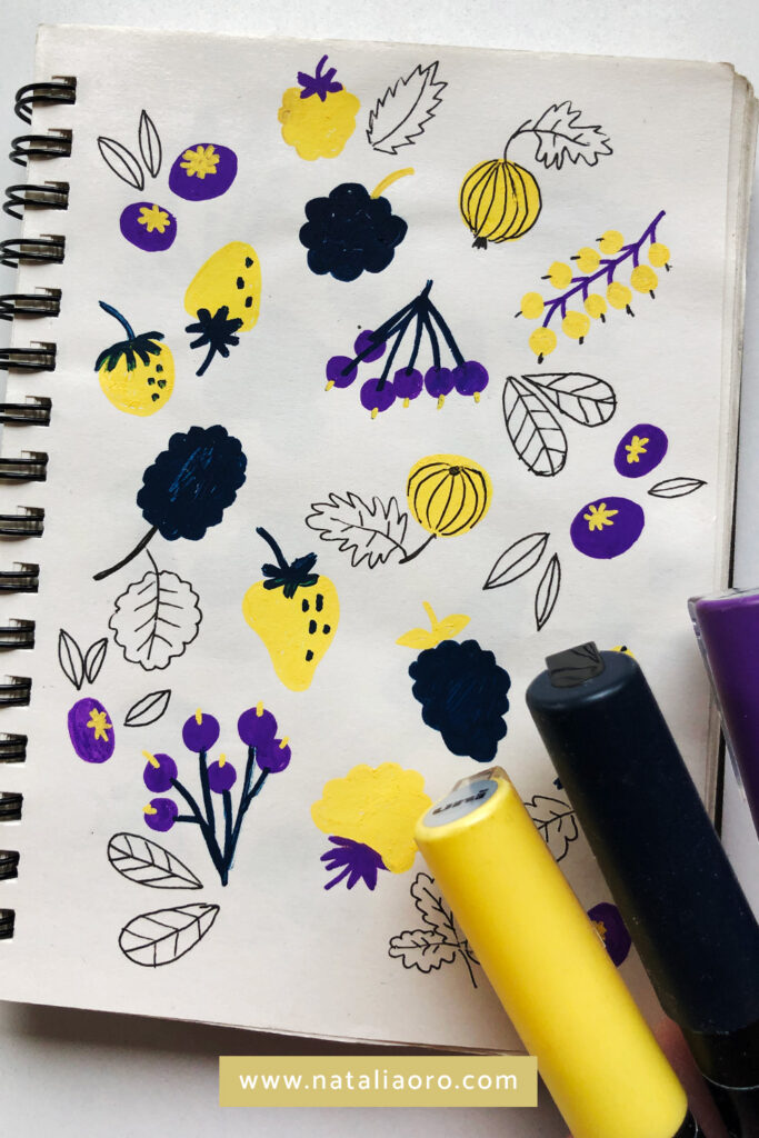
3. Choose randomly colours
Sometimes I just randomly (optionally with my eyes closed) take a few markers and draw with them in my sketchbook. This method is good to loosen up and trying out new, unusual colour combinations. Sometimes it works well, sometimes not so much.
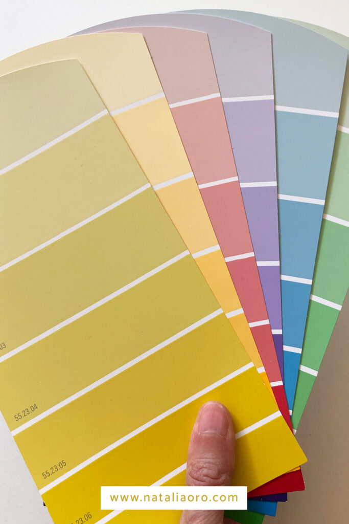
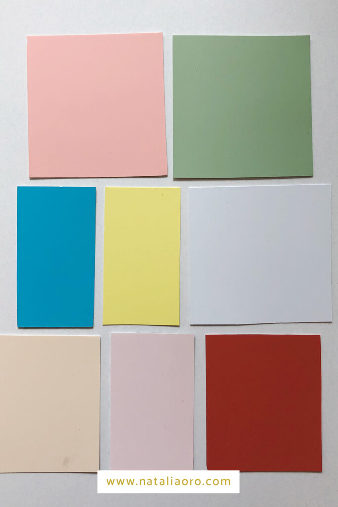
4. Mix and Match colour swatches
Another playful way to find unexpected, surprising and original colour combinations is to collect colour swatches/stripes from your local hardware store. Then cut them into squares and play with them. I recommend picking 3 to 8 colours and try them out. This is a good way to see how they work with each other before you start drawing.

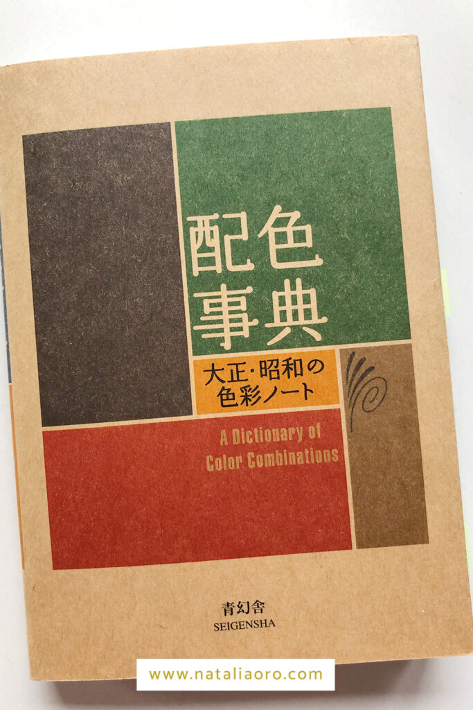
5. Use the colour palettes from the “A Dictionary of Color Combinations” book
A third method for unusual colour combinations is the book “A Dictionary of Color Combinations”. You can choose between 3 or 4 colour combinations. At the end of the book are handy colour swatches that you can tear off and make your own palettes.
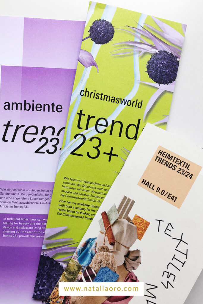
6. Follow trends
If you follow trends, this is the method for you: at trade fairs such as Heimtextil, Christmasworld and Ambiente in Germany are predicted the trend themes and colours of the year. You can find the suggested colour palettes for 2023 here.

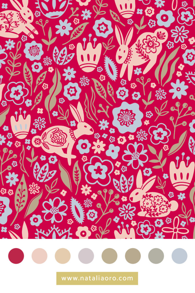
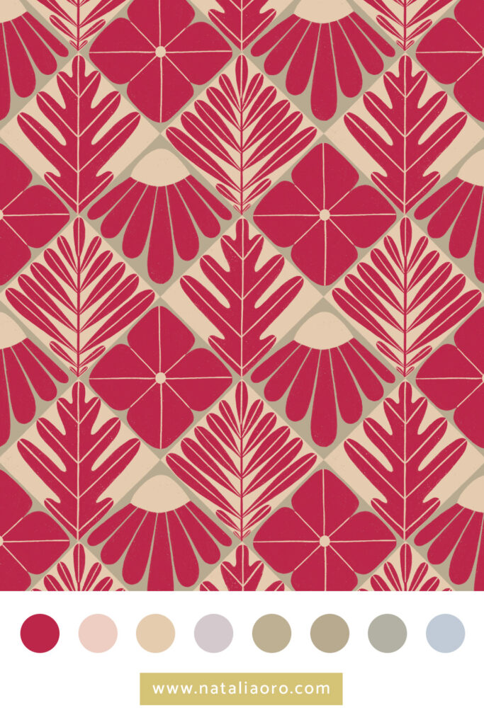
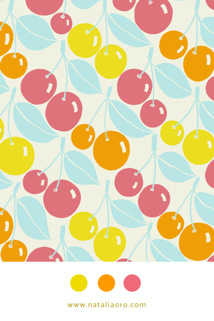
7. Pantone Colour of the Year
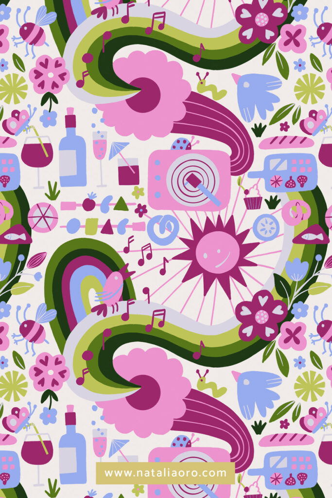
The Pantone colour of the year is another way to work with a trend colour palette. Usually Pantone releases the trend colour for the next year in autumn. If you sell your prints on POD websites, it is a good idea to work with this colour early so that your prints are available for sale before the year starts. Here is my design as an example for 2023 colour of the year – Viva Magenta.
8. Make It In Design & Trends
For all you trend lovers, Make It In Design’s Summer and Winter Schools* are a great opportunity to work on upcoming trends for the next season. There are three tracks – beginner, intermediate and professional – each with two creative trend briefs. Not only is it beneficial for your portfolio to have a few on-trend designs, but it’s also great fun to work on the same assignments with other designers from around the world. I’m surprised every time how different artworks can come out of the same brief.
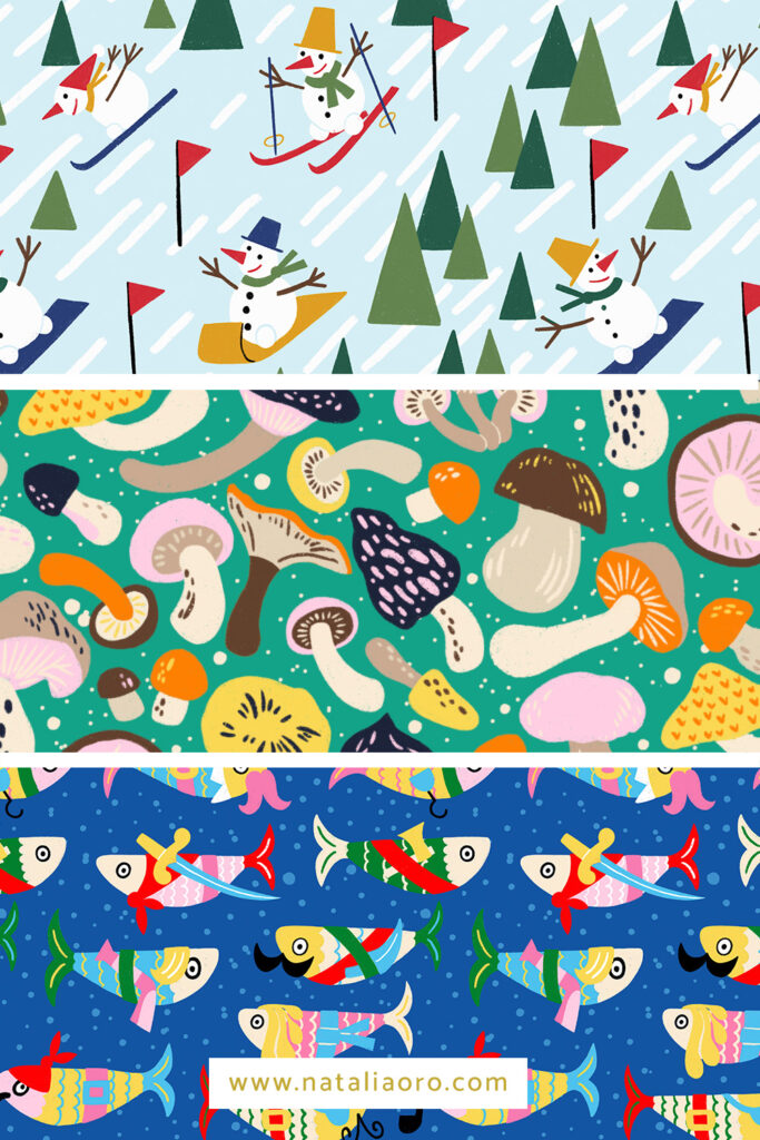
9. Spoonflower design challenges & upcoming trends
Spoonflower introduces a combination of usually three colours for their plain fabrics in their Design Challenge a few times a year. If you create a design with these colours, you can be sure that customers will be able to choose from a wide range of designs to create their own collection, and there will always be a blender print to match your design.
Petal Solids Coordinates: Cozy Design Challenge
Earth Tone Throw Pillows Design Challenge
Petal Solids Coordinates: Optimism Design Challenge
10. Colour palettes provided by surface designers
And last but not least, perhaps my most used method is to work with colour palettes provided by established surface designers in design challenges, courses or newsletters. Some of my favourites are:

*Unfortunately, these classes are no longer offered.