![]()
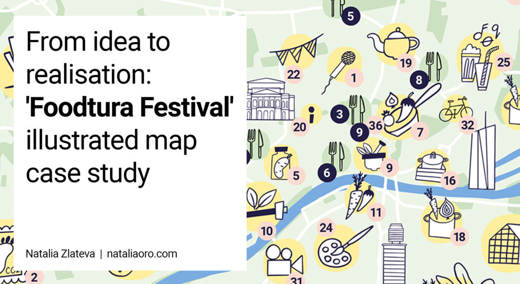
When creating the illustrated map for the Foodtura Festival in Frankfurt and the surrounding area, I faced a number of challenges. I would like to share these experiences with you to give you an insight into my working process. Here are the main challenges I faced and the solutions I found:
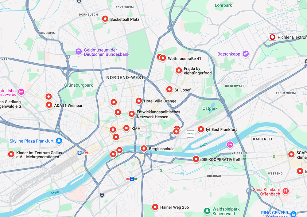
1. events in Frankfurt and surroundings:
the challenge was to show events, some of which were far outside Frankfurt and not visible on the map.
-> I chose a section of the map that showed most of the events. I found a creative solution for the two events that were outside the visible area: They were placed on the edge of the map, with arrows pointing in their respective directions and a clear indication of their location.
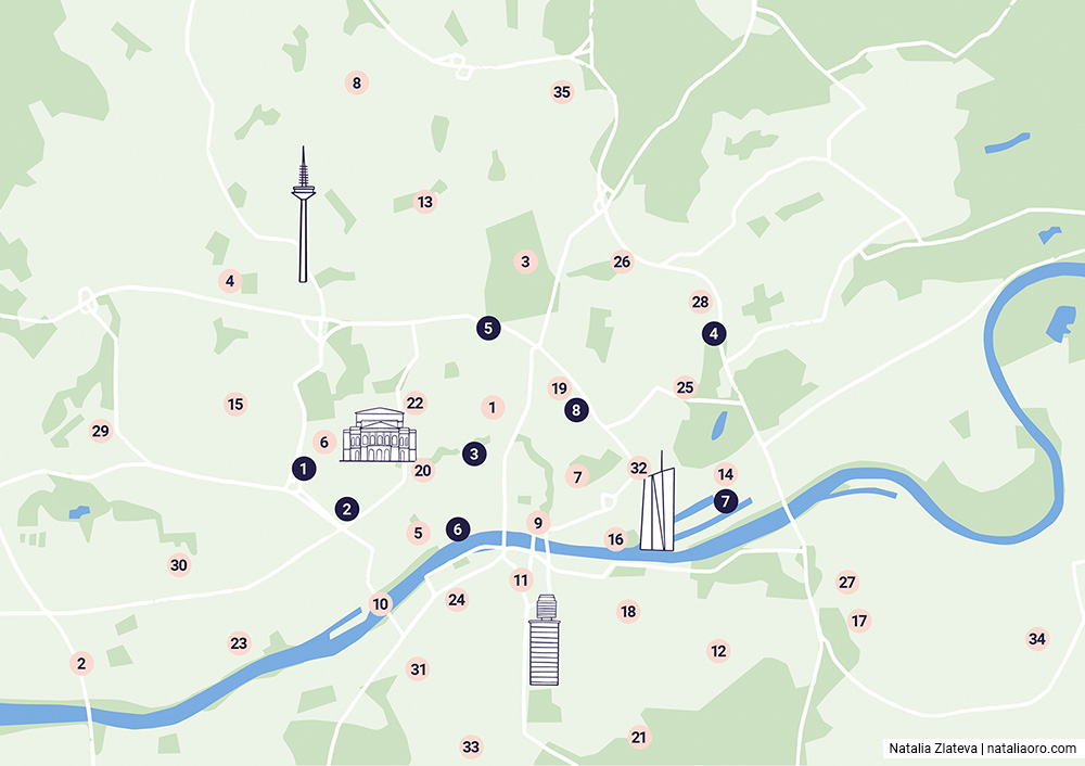
2. provide spatial orientation:
It was important that the map helped participants to find their way around the city and the regions.
-> I integrated well-known landmarks and landmarks of Frankfurt to make it clear in which parts of the city the events were taking place and at the same time show the cardinal points.
3. assist in the selection of events:
Participants should get a quick overview of the events.
-> I used small spot illustrations and visual elements to arouse emotions and curiosity about the events.
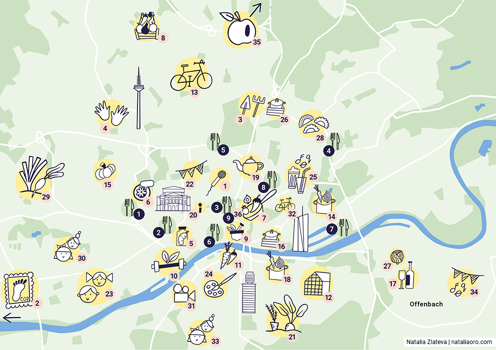
4. uniqueness of symbols:
All the events were about food, cooking and sustainability, so the content was very similar.
-> The icons had to be very clear and easy to understand in order to represent the different events well and enable quick decisions.
5. density of events in the city centre:
Especially in the city centre there were many events in a small area.
-> Due to the dense concentration of events, I decided not to use a combination of text and icons and instead decided to number the venues. The exact information, such as address and event details, was provided in the programme.
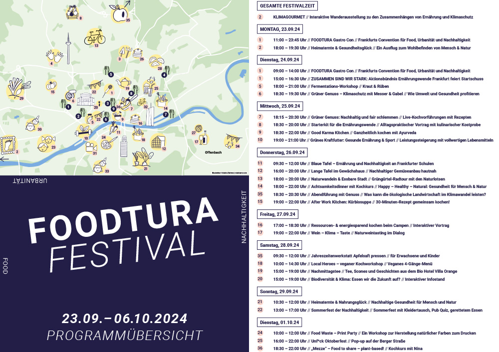
6. visual clarity and organisation:
The map should be visually appealing and clear.
-> I deliberately chose black and white symbols. Coloured illustrations would have cluttered up the map, making it less clear.
7. time consuming due to large number of symbols:
With almost 50 events, I needed an efficient way of working.
-> I decided to use Adobe Illustrator. It allowed me to work quickly and make adjustments easily.
Insights for future projects:
– Define goals, understand target audiences and align decisions accordingly
– Create a clear overview of the geographical locations of events
– Analyse event content and capture the essence in the illustration
– Create bundled icons and label them clearly
– Conduct early colour testing to ensure readability
– Use efficient techniques and tools to manage large volumes of illustrations
– Think about future projects and create an icon library that can be used for similar projects.
Do you have similar challenges in an event or marketing project? Let’s find a creative solution together!
Interested in working together? Please contact me directly and and explain a little bit about
your project.